We knew the PS4 version of Phantasy Star Online 2 would be getting a graphical upgrade compared to the PC version, but during the recent Tokyo Game Show we got a closer look at exactly what changes Sega has been working on. The PC version of Phantasy Star Online 2 had a slider in its graphics options ranging from “Stage 1” to “Stage 5” (with Stage 5 being the highest graphics settings). The PS4 version will be running at what is essentially a new “Stage 6” setting, and that setting will also be making its way back to the PC version.
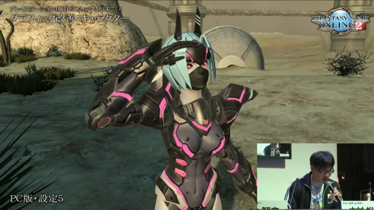
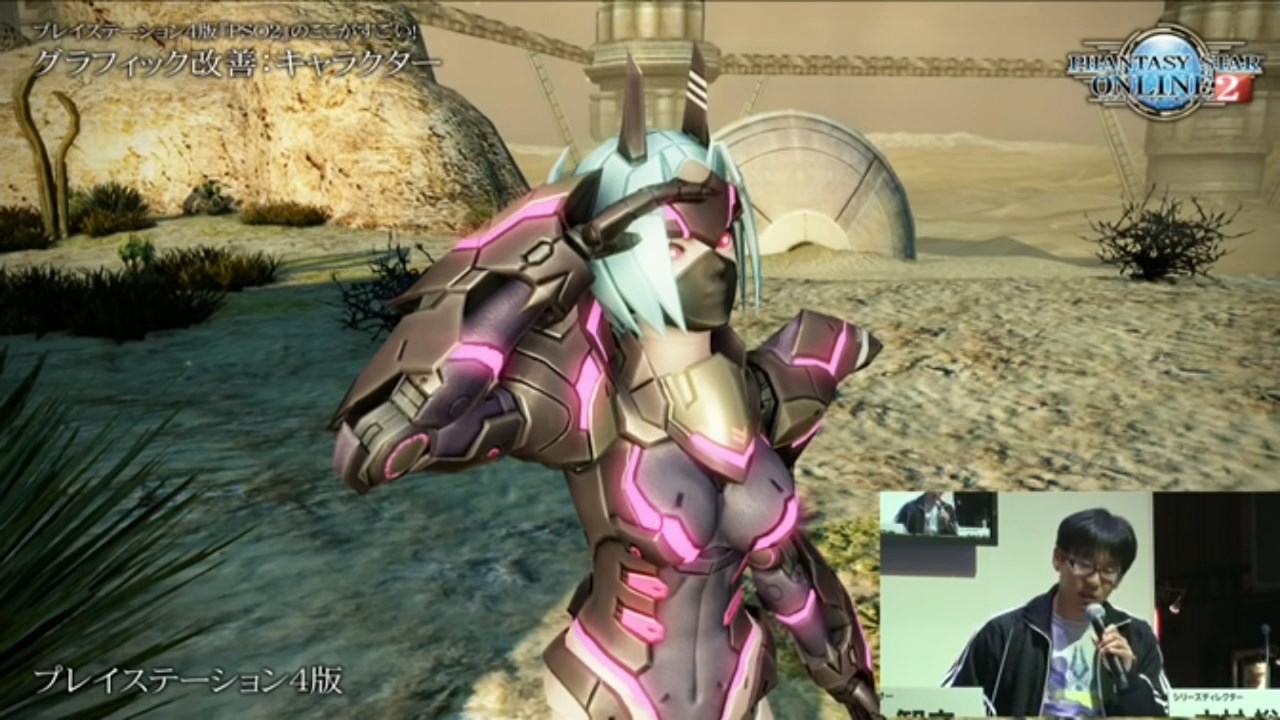
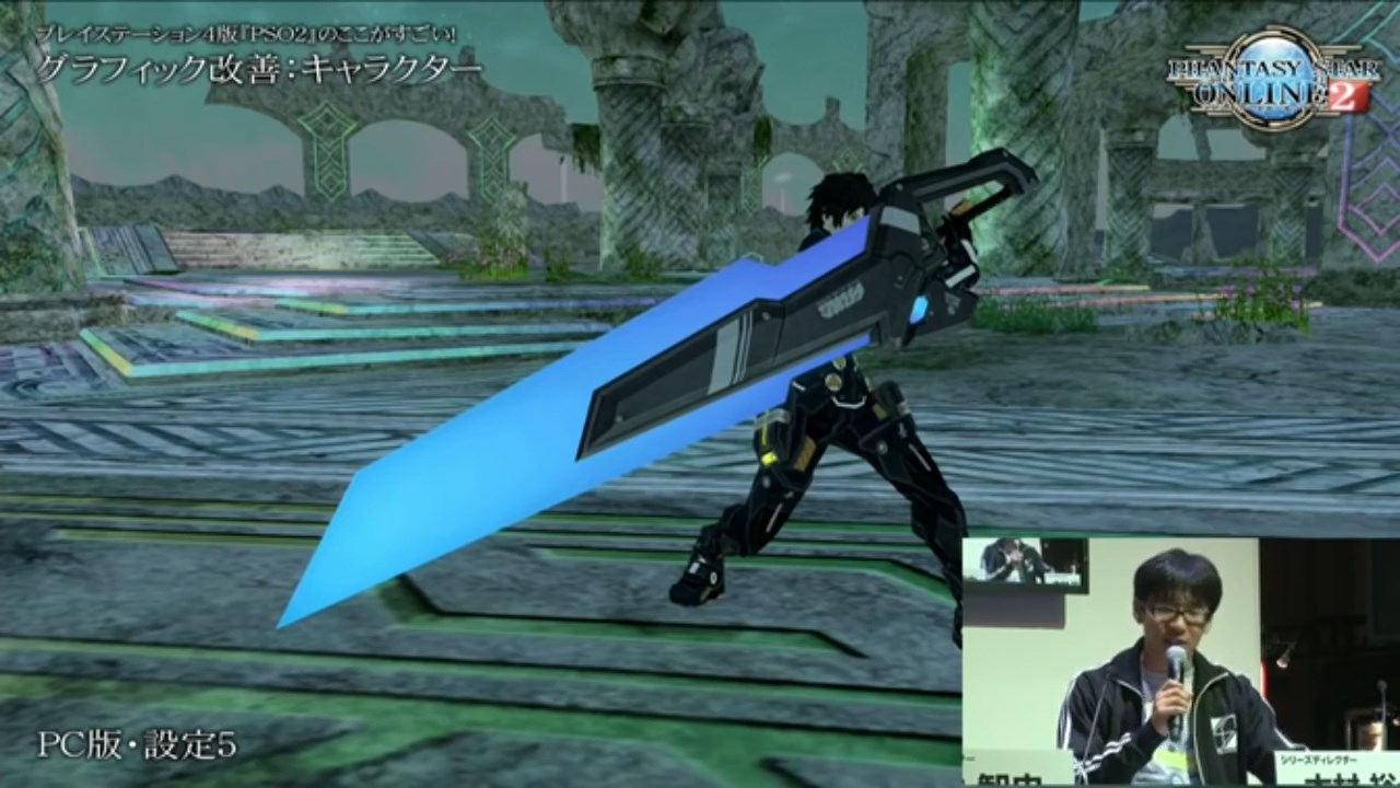
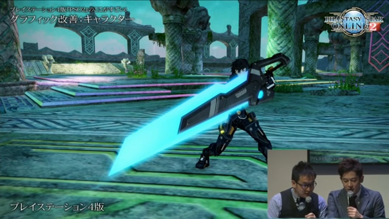
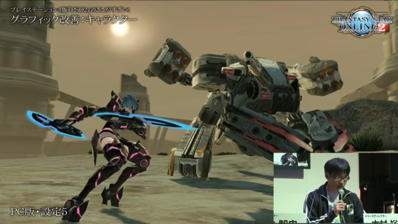
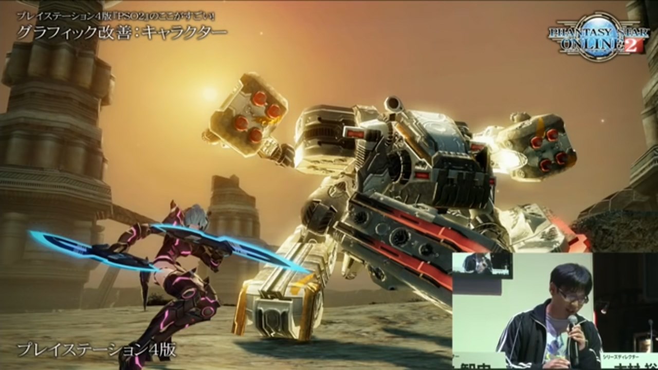
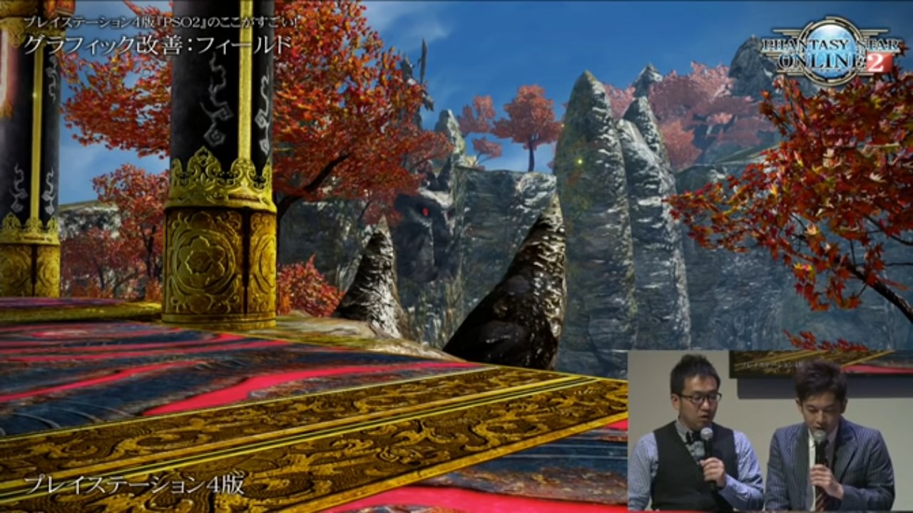
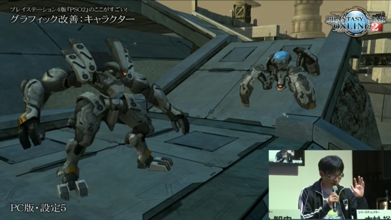
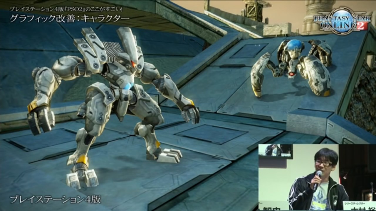
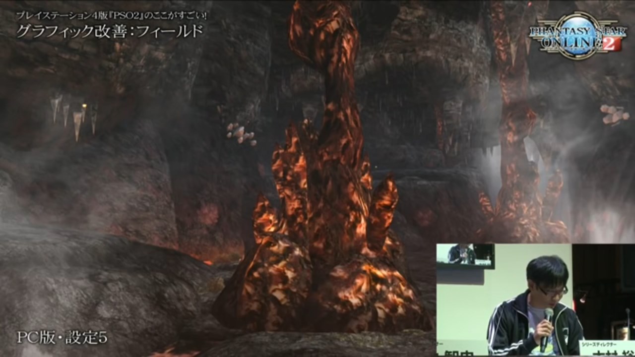
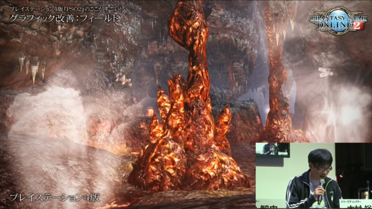
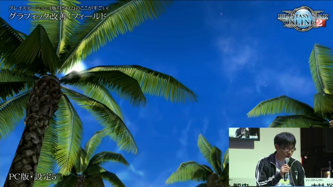
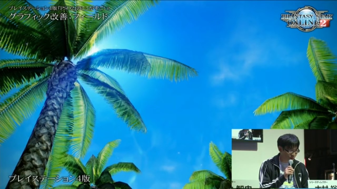
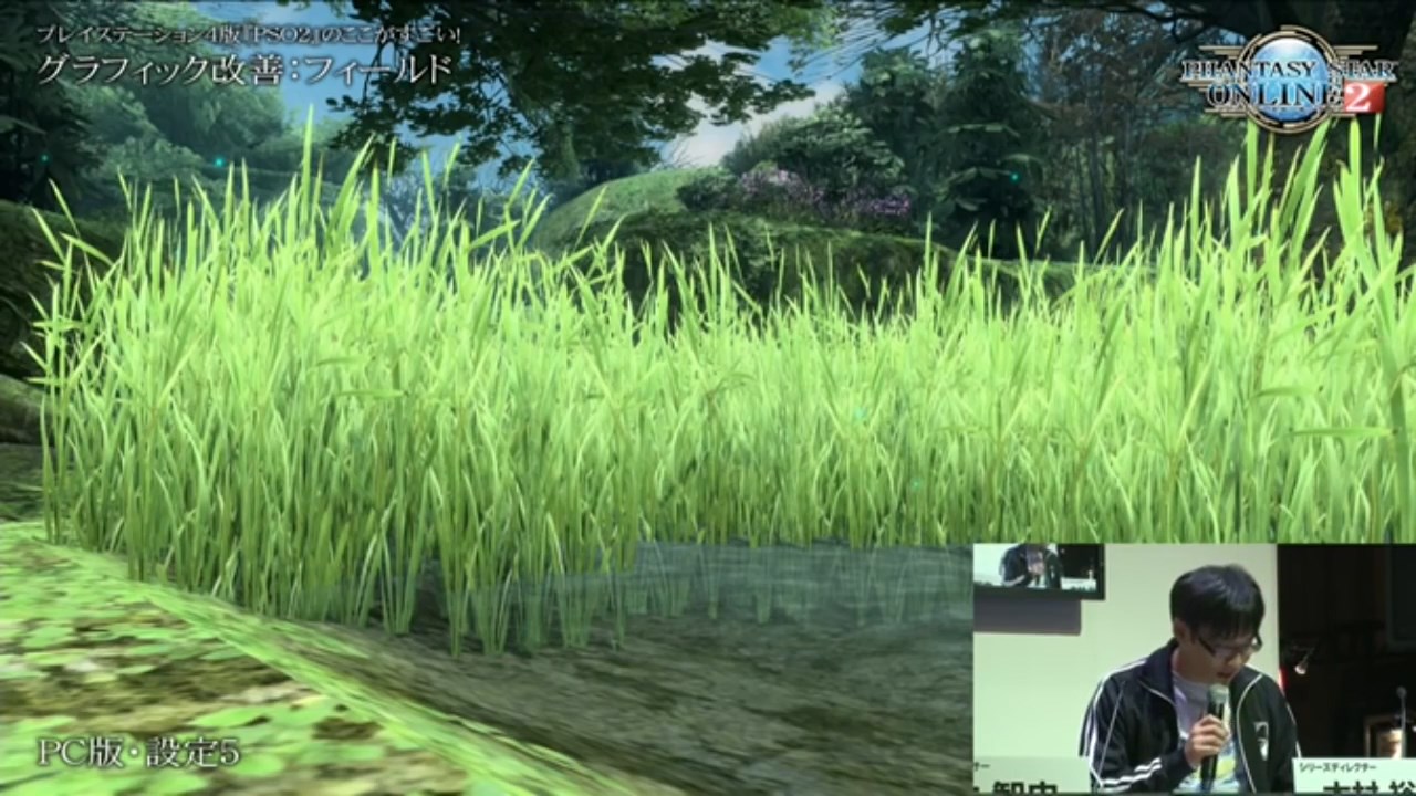
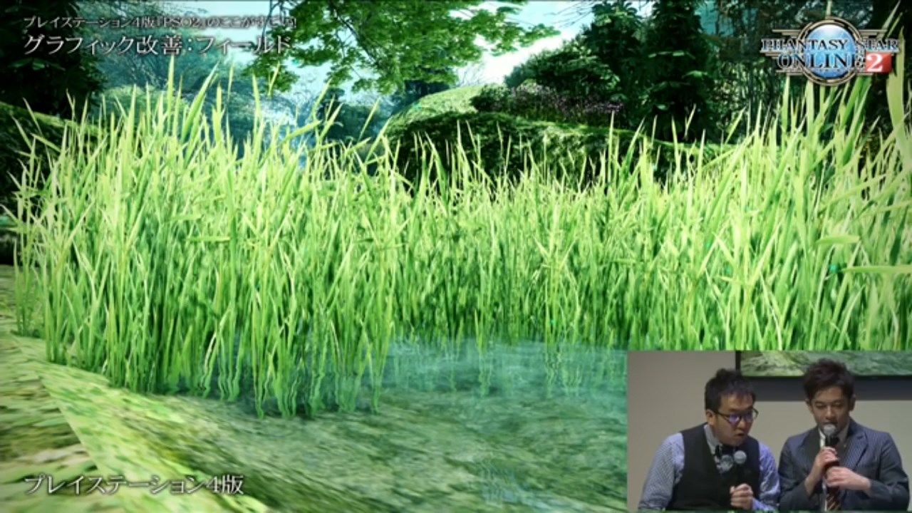
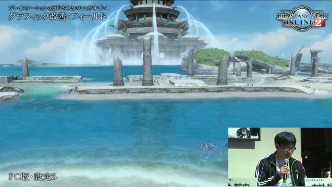
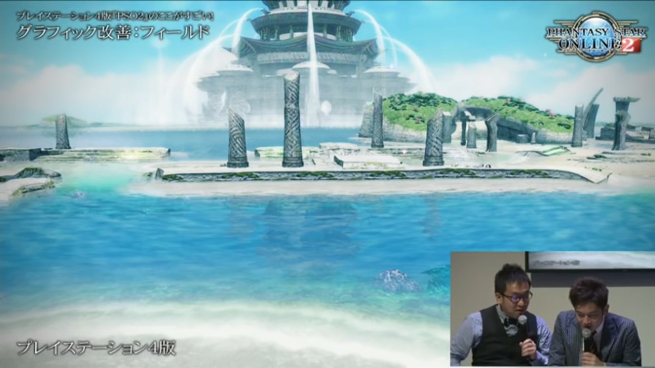
In their recent Tokyo Game Show live streams, Sega showed comparison screenshots between the PC version running in its highest settings and the new PS4 version. Below you can see all those comparison screenshots (PC on the left, PS4 on the right), taken from their live stream. The quality isn’t the best, but it’ll suffice to examine the difference between the two. Let’s start with the first comparison:
What’s immediately obvious in the first screenshots is the difference in the ground texture. On the PS4 version it looks a lot more detailed. That said, I don’t get the impression that the actual textures on the PS4 version are any different from the current PC version. Rather, the PS4 version seems to be making use of bump/normal mapping to create the illusion of a more detailed 3D surface. It’s a relatively easy way of upgrading the look of the game without actually adding higher resolution textures.
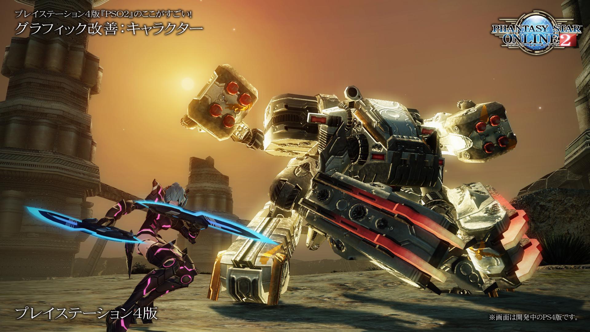
Another change that is very obvious is the lighting. The PS4 version literally puts the spotlight on the game, and the game looks a lot brighter as a result. Also noticeable is the bloom effect on the pink parts of the armor. In the original version, these parts didn’t “glow”. In the PS4 version, you can see the pink color starts to “bleed out” over the other parts of the armor, simulating a glow effect. However, you can also see that the exaggerated lighting on the rocks in the back are actually starting to obscure details that were more visible in the PC version. The same changes are also visible throughout the other comparison screenshots.
In the second comparison above, the weapon now has a glowing effect in the PS4 version. However, the detail in the stairs in the background on the PS4 version is almost completely lost due to how strongly the light reflects from the surface. The colors in the PS4 version are starting to feel over-saturated here as well.
The third comparison above perhaps best reflects (pardon the pun) the style the team is aiming for. Everything is baking in sunlight, arguably too much so.
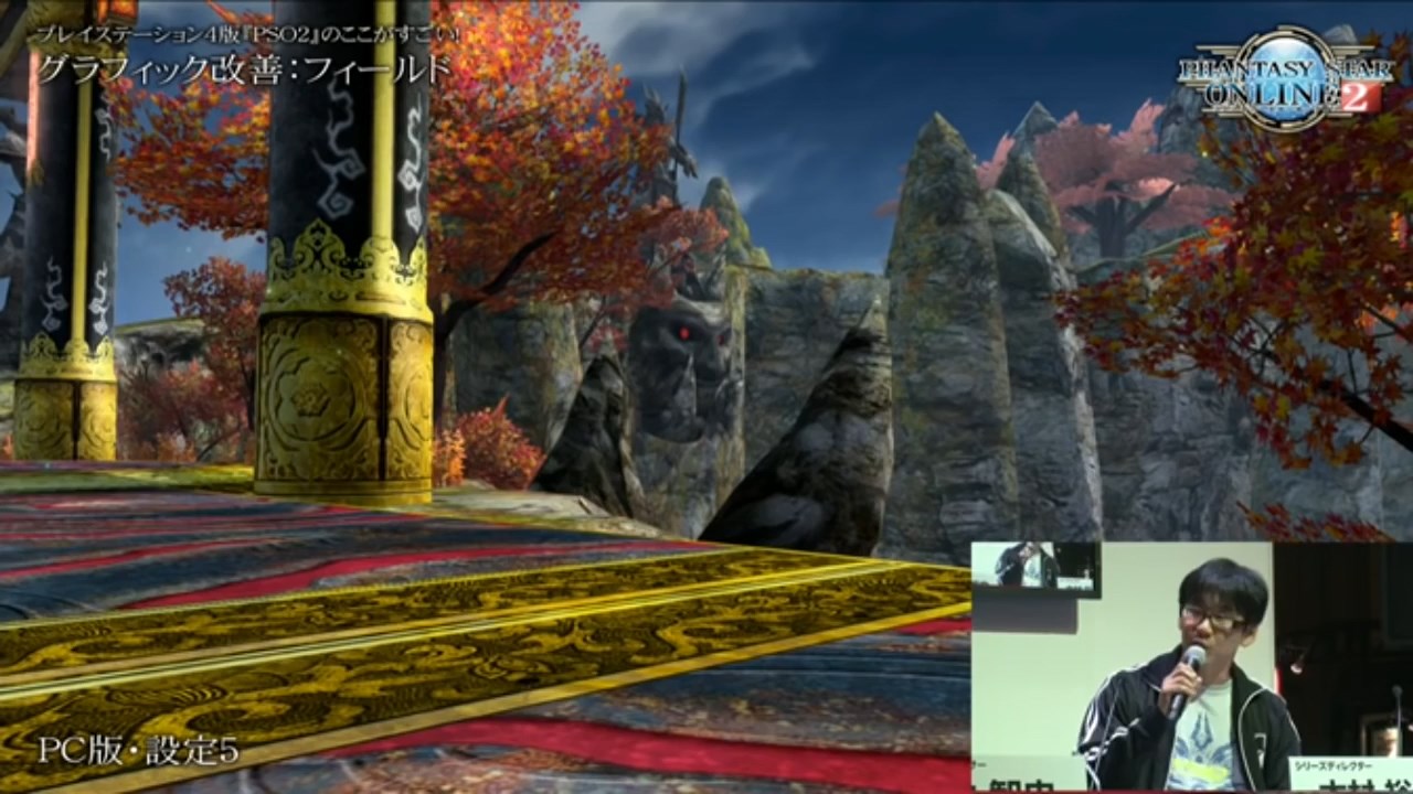
The comparison above also highlights another problem with the changes. Everything certainly looks a lot less “flat” in the PS4 version than in the PC version. However, while the rocks certainly look more detailed, they look so “shiny” that they hardly even look like rocks anymore. I’ll leave you with a few more comparison screenshots taken from the stream.
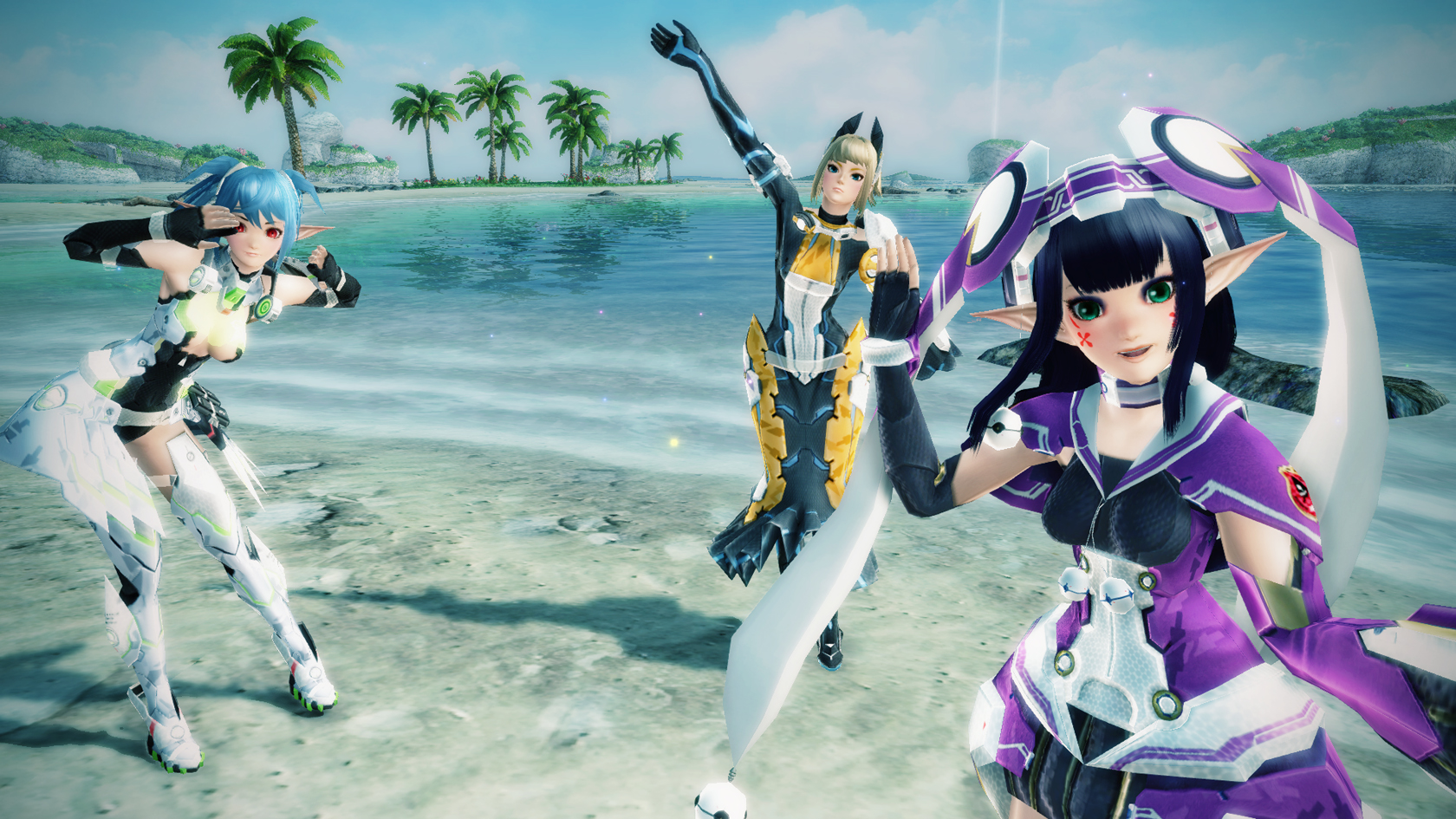
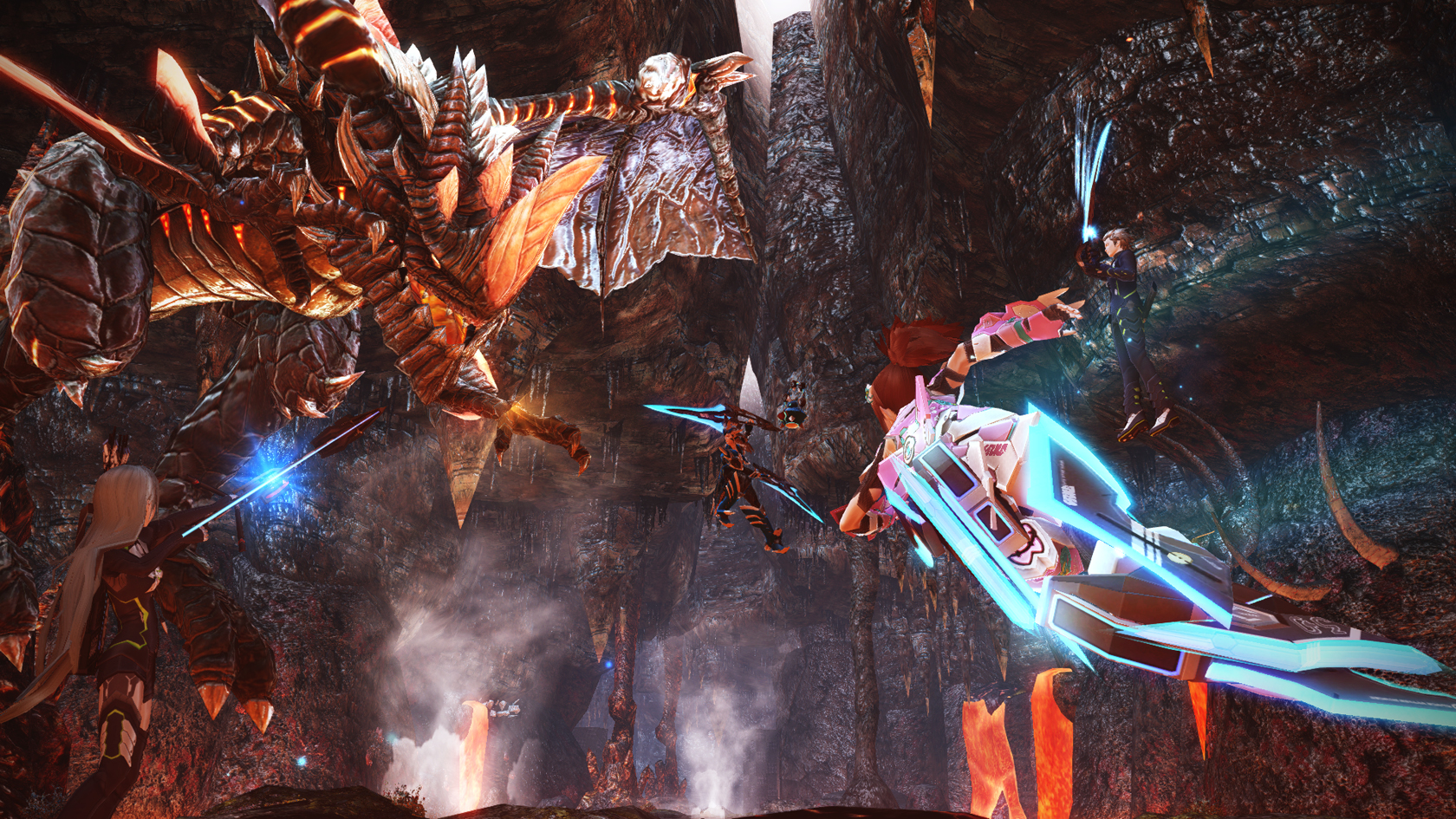
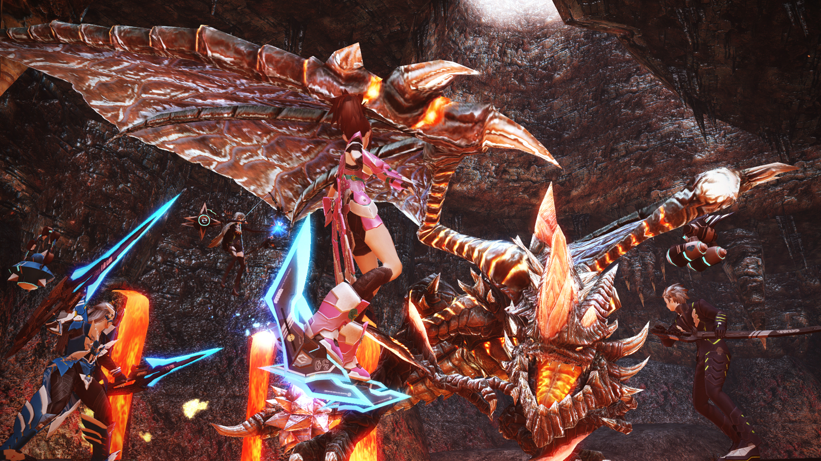
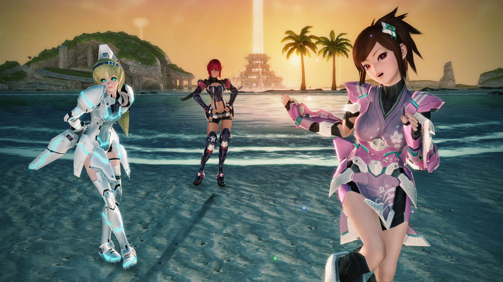
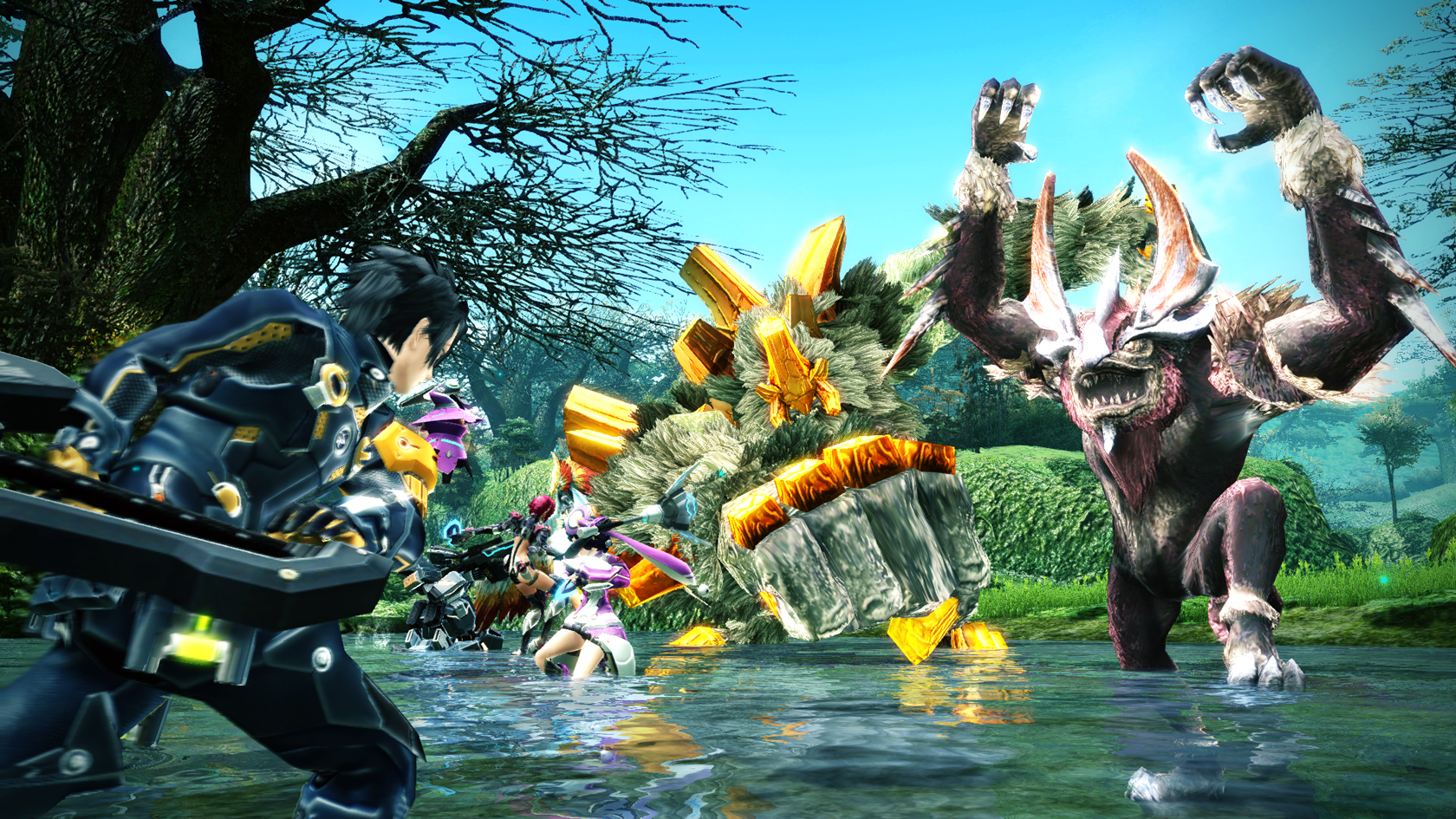
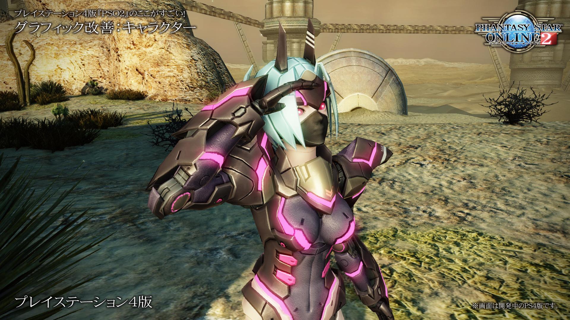
In any case, it’s clear that the graphics aren’t receiving a drastic overhaul. The actual 3D models appear to remain the same in terms of polygon count, and even the textures themselves don’t appear to have been replaced. The visual upgrade is certainly there, but I think Sega would do well to tweak the PS4 version a bit more to tone down the overall brightness and bloom effect. I’ll leave you with a few high-resolution screenshots from the game’s PS4 version. We’ll have another article up with more information regarding the PS4 version of Phantasy Star Online 2 soon.

so when is this coming to europe ?
Unfortunately we simply don’t know. We’ve been trying to get information from Sega but they aren’t forthcoming with news… It’s not looking particularly good for the chances of this game being localized at the moment.